Access Mobile Websites Using Desktop Browser (PC)

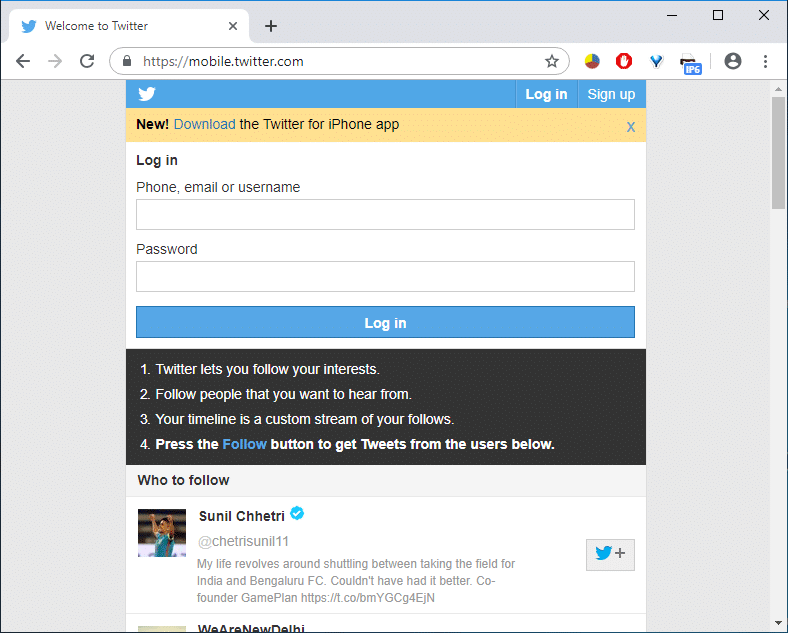
In our daily lives, while dealing with online web usage, there are many websites we visit daily. Opening such websites using any Mobile devices will normally come up with automatically resized & smaller versions. This is because the page can load faster for all the mobile devices & hence reduce the consumer’s data usage. For your information, the bootstrap concept is used behind this. Using a mobile compatible website on a desktop browser becomes useful when you have a slower internet connection and quickly can load any web page. Now opening any website in the form of the mobile version not only lets you access the website faster but also helps in saving data usage.
This feature of viewing your mobile version of the website on your desktop browser also helps developers check and test mobile websites. In case you are searching for an approach to open and access any website as a mobile version from your desktop browser, this article is for you.
Access Mobile Websites Using Desktop Browser (PC)
Make sure to create a restore point just in case something goes wrong.
Method 1: Open Mobile Websites Using Google Chrome
Accessing the mobile version of any website from your PC browser needs the use of User-Agent Switching extension. This is available for Chrome web browser. Here you have to follow some steps to access the mobile version of any website in Chrome browser of your desktop.
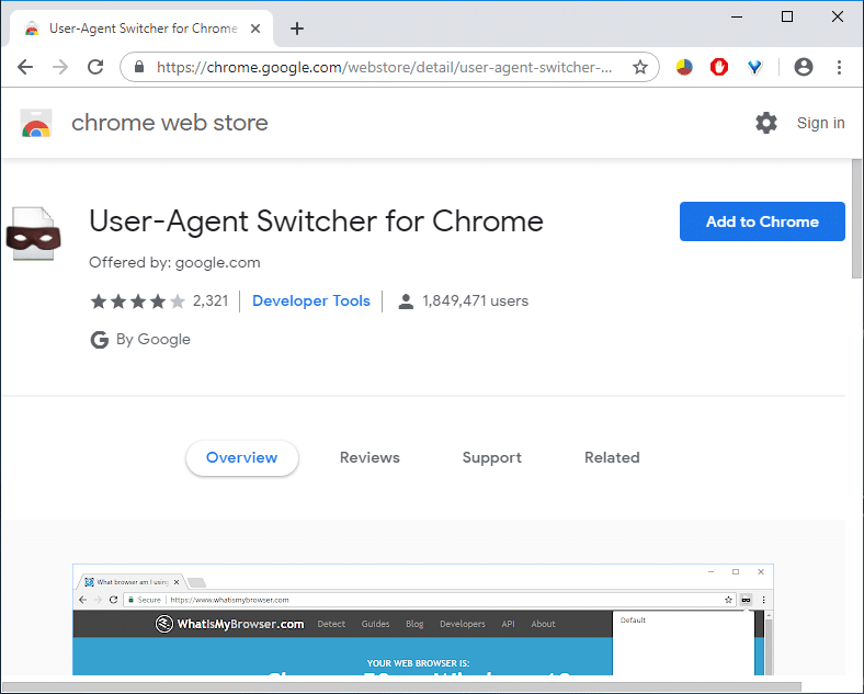
1. First, you have to install the User-Agent Switcher extension on your Chrome browser from this link.
2. From the link, click on “Add to Chrome” to install the extension on your browser.
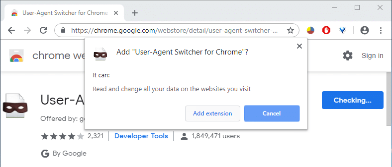
3. A pop-up will come up, click on Add extension and restart Chrome.
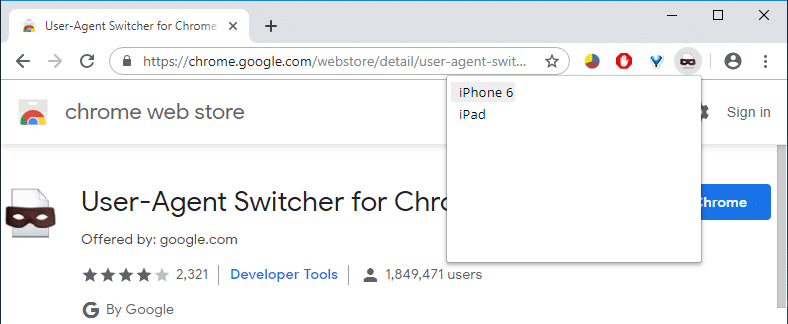
4. Next, from your browser’s easy access bar, you have to select the shortcut for “User-Agent Switcher” extension.
5. From there, you have to select your mobile web engine, like, if you want to open an Android-optimized web page, you have to select “Android”. You can pick any device according to your preference.
6. Now visit any webpage and that website will be in the mobile compatible format you select earlier.
PRO TIP: 12 Ways To Make Google Chrome Faster
Method 2: Open Mobile Websites Using Mozilla Firefox
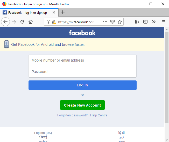
Another popular web browser is the Mozilla Firefox, in which you have to add a browser add-on to access mobile compatible websites. To do this, you need to perform the following steps:
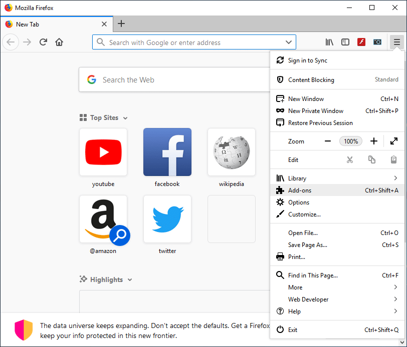
1. If your desktop has a Mozilla Firefox web browser installed, you need to install an add-on in your browser. To do this, you have to click on the Settings button from your browser and choose “Add-ons”.
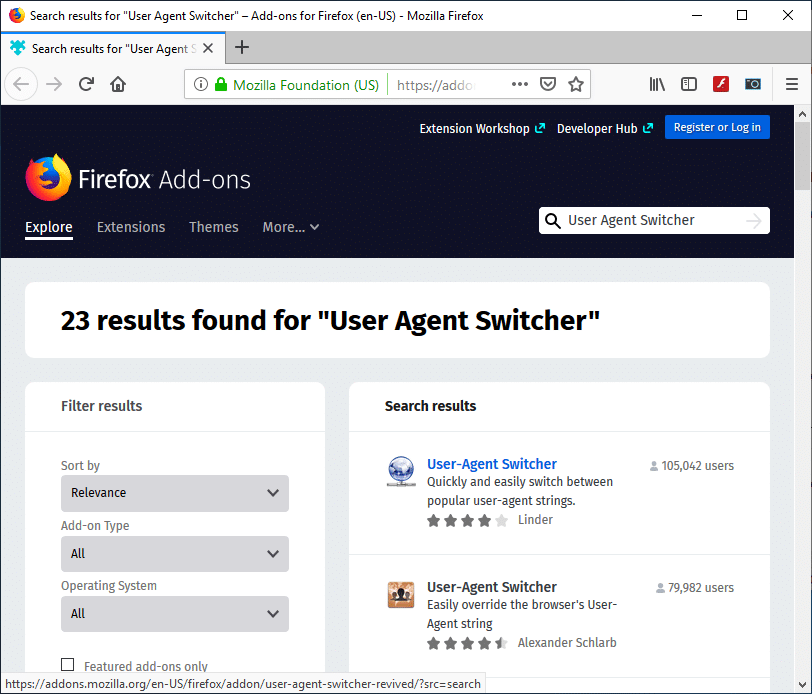
2. Search for the User-Agent Switcher.
3. Now click on the first result of the User-Agent Switcher extension search.
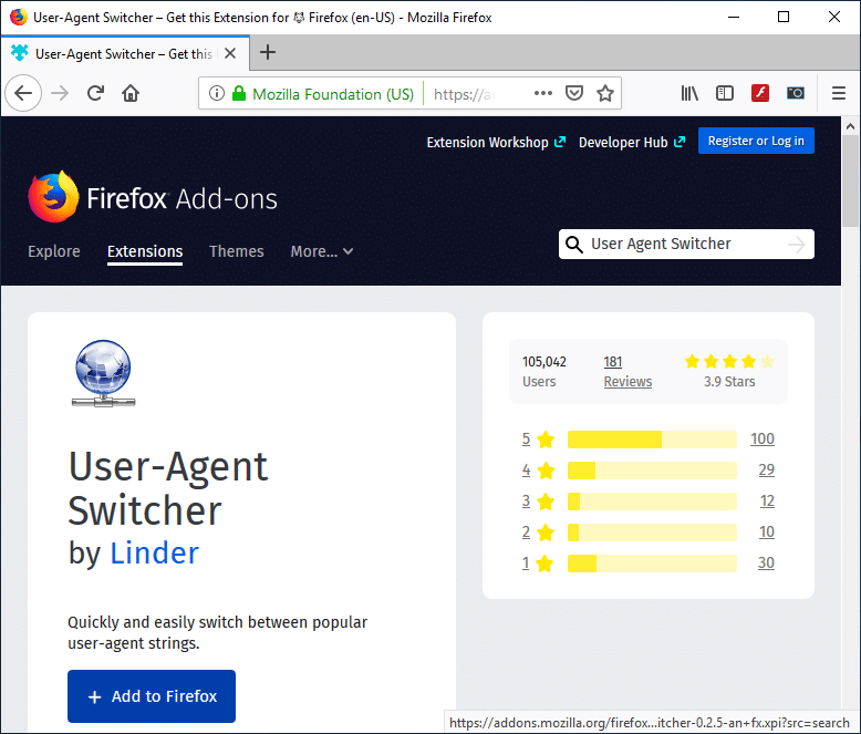
4. On the User-Agent Switcher page, click on Add to Firefox to install the add-on.
5. Once the Add-on is installed, make sure to restart Firefox.
6. Next time you open your browser, you can see a shortcut of the User-Agent Switcher extension.
7. Click on the shortcut icon and choose the default User-Agent Switcher. You have the option to choose any Mobile device, Desktop Browser, and Operating System.
8. Now open any website that will open in the mobile version of the website on your desktop browser.
Method 3: Using Opera Mini Simulator (Deprecated)
Note: This method does not work anymore; please use the next one.
If you do not like the above two methods of using User Agent Switcher option, you still have another way of viewing a mobile-optimized version of any website on your desktop browser using another popular simulator – Opera Mini Mobile Website Simulator. Here are the steps to access the mobile version of any website on your PC web browser using the Opera Mini Simulator:
- You can start any web browser of your preference.
- In the address bar type and navigate to the Opera Mini Mobile Website Simulator webpage.
- To start using the simulator you need to give some permissions, click Agree.
- The next time you will open any sites in your browser, it will be in mobile-optimized version.
Method 4: Use Developer Tools: Inspect Element
1. Open Google Chrome.
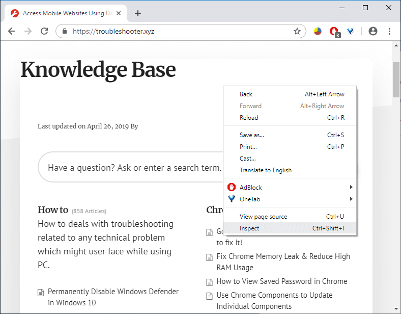
2. Now right-click on any page (which you want to load as mobile-compatible) and choose Inspect Element/Inspect.
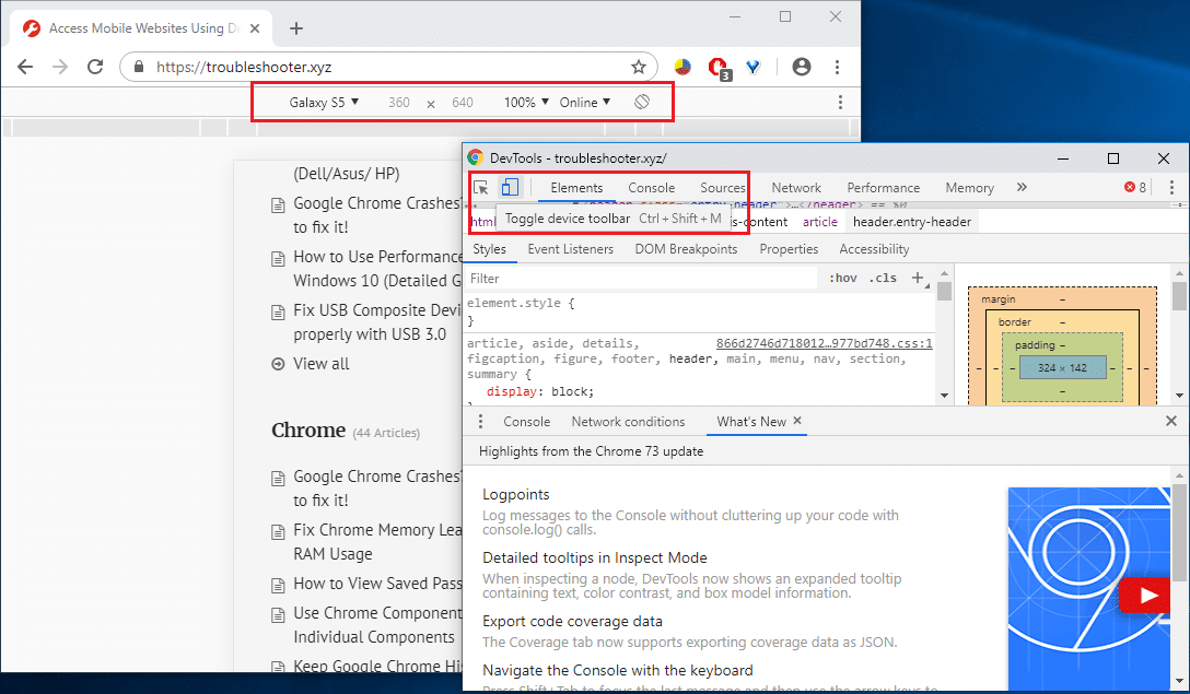
3. This will open the Developer’s Tool window.
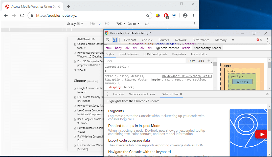
4. Press Ctrl + Shift + M, and you will see a toolbar will appear.
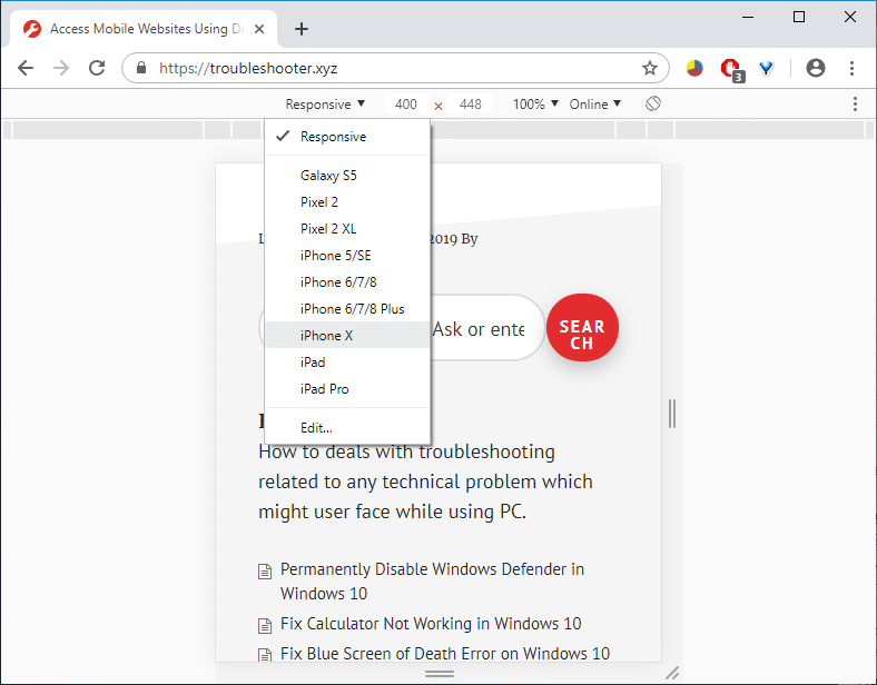
5. From the drop-down, select any device, for example, iPhone X.
6. Enjoy the mobile version of the website on your desktop browser.
Recommended:
I hope this article was helpful. You can now easily Access Mobile Websites Using the Desktop browser, but if you still have any questions regarding this tutorial, please feel free to ask them in the comment’s section.
